2020 · UX/UI AUDIT & REDESIGN / Jules Verne Museum
Make the museum’s story
easier to explore.
A 2020 UX/UI audit and redesign proposal exploring information architecture and navigation for the Jules Verne Museum in Nantes.
Role
UX/UI Audit · Information architecture · Web design
Period / status
2020 · Design proposal
People
Visitors exploring museum content
Scope
Site review · Content grouping · Navigation · Web UI
01 / AUDIT SCOPE
Three questions about finding information.
The surviving project description identifies fragmented information and overlapping content. This retrospective follows three needs: discovering the museum, preparing a visit and exploring its resources.
02 / FINDINGS → DESIGN DECISIONS
Connect each question to the screen.
01
Can visitors understand the navigation by purpose?
Problem to examine
As information becomes more fragmented, visitors must first interpret where their task belongs.
Decision & visible evidence
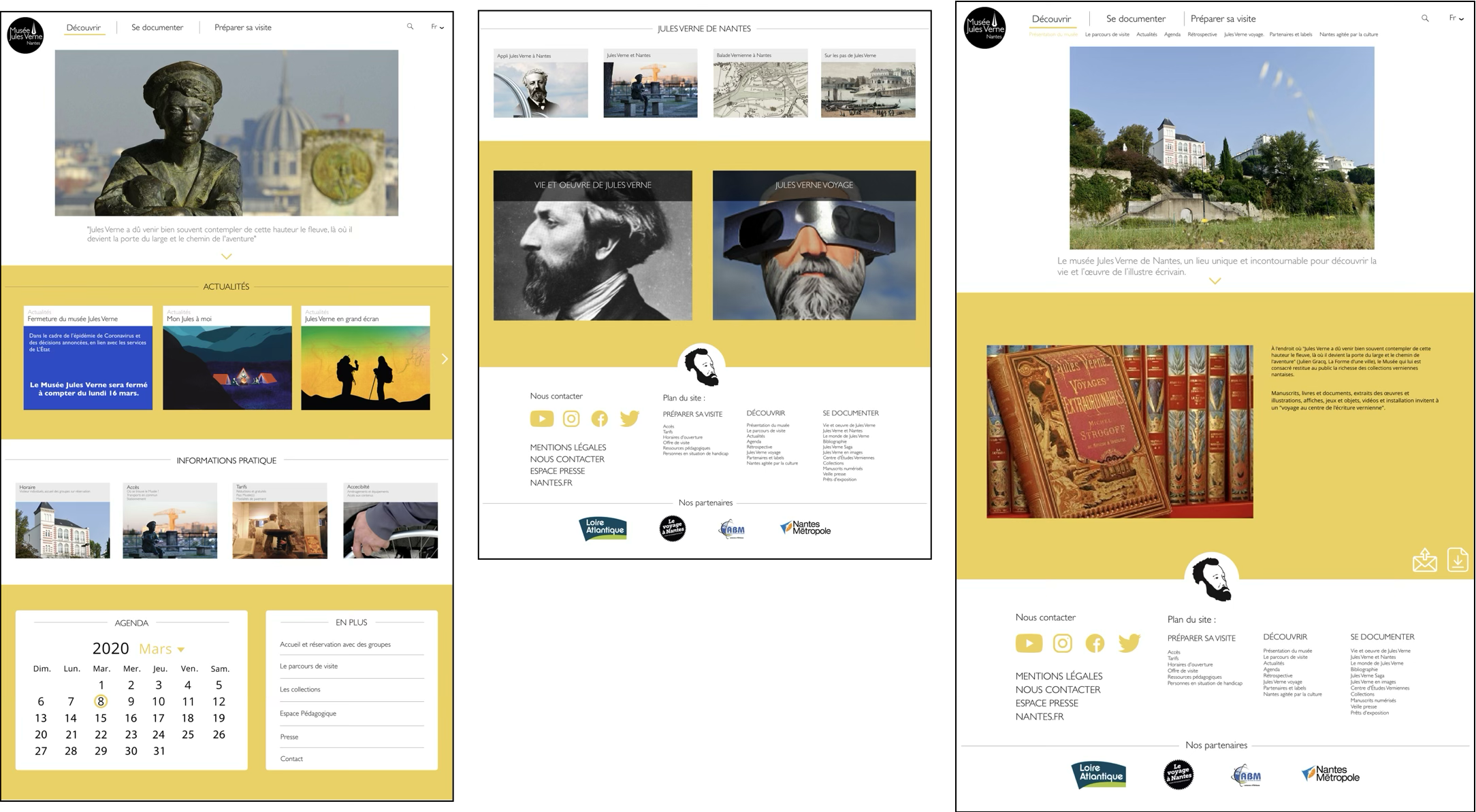
Use the purpose of a visit as the top-level grouping. The saved screen shows Découvrir (Discover), Se documenter (Research) and Préparer sa visite (Plan a visit).
Design intent
Make the main categories readable before the details, giving first-time visitors a starting point that matches their purpose.
If hours, directions and prices are separated, visitors need to move between sections before planning a visit.
Decision & visible evidence
Treat practical information as a single group. The saved Informations pratique section places hours, directions, prices and accessibility together.
Design intent
The grouping brings information needed for one visit decision into a shared location.
Visit information · hours, directions, prices and accessibilityFull artifact ↗
03
Are content themes and priorities distinguishable?
Problem to examine
Presenting the author’s life, works and connection to the city at the same level can make themes harder to distinguish.
Decision & visible evidence
Review topic grouping together with visual hierarchy. The saved screen groups Nantes-related resources into small cards and uses larger image areas for the author’s life and travels.
Design intent
Image scale and background regions reveal relationships and offer cues for choosing a topic.
Content groups · Nantes, the author’s life and travelsFull artifact ↗
03 / PROJECT ARTIFACT
The complete design artifact.
The details above come from this saved project image. Open it to inspect the full composition.
Expand the full project image
01 / 2020 project artifact · museum web layouts
04 / OUTCOME & REFLECTION
What the proposal shows.
A 2020 website redesign proposal addressing navigation, practical visit information and content hierarchy.
The evidence presented here is a design artifact; task-time reductions and usability gains have not been established by this material.
Next evaluation
A next evaluation would follow first-time visitors finding hours and prices, then reaching a topic of interest. Task completion and moments of hesitation would help assess the design more concretely.